


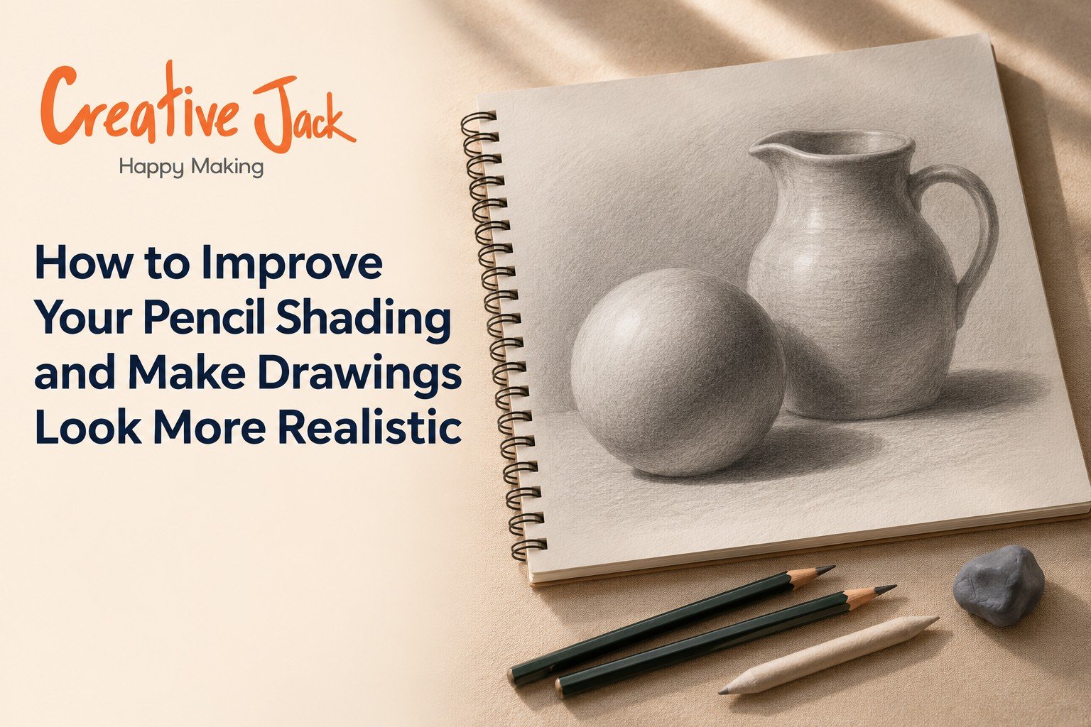
How to Improve Your Pencil Shading and Make Drawings Look More Realistic
To make pencil drawings look more realistic, widen your range of tones, control your edges, and build shading in thin layers instead of pressing hard. Realism comes less from drawing more detail and more from getting the values right: a clear difference between your lightest light and your darkest dark, soft edges where forms turn, and sharp edges where they stop. This guide explains how to do each of those, and how to render common surfaces like skin, metal, glass, and fabric.
What You'll Find in This Guide
• Why many pencil drawings look flat, and how to fix it
• How to widen your tonal range and test it
• The three kinds of edge that make forms look solid
• Layering, pressure, and paper: the practical side of smooth shading
• How to render different textures
• A simple checklist to run on every drawing
Why Your Shading Looks Flat
A lot of beginners can shade neatly and still end up with drawings that look flat. The reason is usually not technique. It is range.
When you shade carefully with a single pencil and light pressure, all your tones end up in a narrow band of mid-greys. The darkest area is only a little darker than the lightest, so the drawing has no punch. Real objects have a much larger range. A white cup in sunlight has bright, almost pure-white highlights, and the inside of the handle can be nearly black.
If you want to improve pencil shading and make drawings look realistic, this matters more than any single technique. So the first step towards realism is not smoother shading. It is stronger contrast. If you have not read it yet, our post on seven shading techniques covers the pencil shading techniques themselves. This guide builds on that and focuses on what makes shading look real.
Step 1: Build a Wider Value Range
A value is how light or dark a tone is. Artists often work with a scale of around nine steps from white to black. Beginners usually use three or four.
How to shade realistically starts with range. Try this test. Draw a strip of nine squares. Shade the first one white (leave it blank), the last one as dark as you can make it, and the seven in between in even steps. If your darkest square is only mid-grey, you need a softer pencil, more layers, or both.
Use the right pencils. An HB cannot produce a deep black on its own without pressing so hard that it shines. Use a 2B for mid-tones, a 4B for darker areas, and a 6B for your deepest darks. If you want help choosing, see our guide to drawing pencil types.
Keep your lightest areas clean. Real highlights are the white of the paper. Plan them before you start and avoid shading over them. Lifting graphite with an eraser afterwards works, but it is never quite as clean.
Step 2: Check Your Values With a Squint
You cannot always trust your eyes when you are close to a drawing. Two tricks help.
Squint at your subject and at your drawing. Squinting blurs detail and exaggerates tone. If the dark areas on your subject look much darker than the dark areas on your drawing, you need to push them.
Use a grayscale reference. If you are working from a photo, convert it to black and white on your phone. Without colour, the values are much easier to read. Compare the greyscale photo to your drawing, patch by patch.
A third trick is to take a photo of your drawing and view it in black and white. The camera shows you the real contrast, not the contrast you think you see.
Step 3: Learn the Three Kinds of Edge
Edges matter as much as tone. Beginners often draw every edge the same way, with one firm line around everything. That is a quick path to flatness.
Real forms have three kinds of edges.
Hard edges. The boundary is sharp and clear. These appear where one object is clearly in front of another, or where a surface turns suddenly, like the rim of a cup.
Soft edges. The tone fades gradually from light to dark, as on a rounded cheek or a ball. These appear where a form turns slowly.
Lost edges. The boundary almost disappears, because two areas have similar tone. These often occur in shadows, where a dark object meets a dark background.
Using all three gives a drawing depth. A cheek is soft, the edge of the nose where it meets the shadow is firmer, and the edge of hair against a dark background might be nearly lost. Your eye reads these differences as three-dimensional form.
How to practise. Shade a sphere. Make the side facing the light a soft edge, blended gradually. Make the edge of the cast shadow on the table slightly harder. Then make the lower edge of the sphere nearly merge with the shadow. You have just used all three.
Step 4: Build Tone in Layers
Pressing hard on the first pass is the most common reason shading turns out patchy, shiny, or streaky.
Work in layers. Begin with a very light layer over the whole area, using a sharp pencil and even strokes. Add a second layer in the darker areas, a third in the darkest, and so on. Each pass adds a little depth, and the graphite grain evens out.
Change direction slightly. If every layer goes in the same direction, you will see lines. Rotate your strokes a little with each layer, or use small circles.
Use the side of the pencil. For large areas, the side of the lead covers more ground and gives a softer grain than the tip.
Blend lightly. A blending stump or tissue can smooth the tone. Use it gently and then add more graphite on top. Over-blending can make a drawing look foggy and lifeless, so keep some texture.
Avoid shine. If your darks look glossy, you have pressed too hard and flattened the paper. Pencil shines at a certain angle, and the area becomes hard to darken further. Prevent this by building darks gradually.
Step 5: Add Reflected Light
Beginners tend to shade the shadow side of an object as a single dark mass. Real shadow sides are not that simple. Light bounces off nearby surfaces and gently illuminates the shadowed side, which creates reflected light.
On a sphere, this appears as a slightly lighter band near the lower edge of the shadow side, between the core shadow and the cast shadow. It is never as bright as the lit side, but it is lighter than the core shadow.
Adding this detail is one of the most effective ways to make a drawing look round. Leave a slim band of the shadow side a little lighter, and keep its edge soft.
Step 6: Choose the Right Paper
Paper affects shading more than people expect.
Smooth paper gives fine detail and very smooth blends, but it holds less graphite, so deep darks are harder.
Medium tooth paper grips graphite well, gives richer darks, and is a good all-round choice.
Rough paper produces a visible grain, which can look expressive, but makes fine detail difficult.
If your darks will not get dark, or your shading looks patchy, test a different paper before blaming your technique.
Step 7: Render Different Textures
Realism often depends on convincing textures. Here is how to approach common ones.
Skin. Smooth, soft gradients, with no hard outlines. Use light layers and blend gently. Keep highlights on the forehead, nose, and cheekbones. Skin pores and wrinkles are usually suggested, not drawn one by one.
Metal. High contrast. Bright highlights sit right next to very dark reflections, with sharp edges between them. Think of a spoon: a strong white streak next to deep black.
Glass. Mostly highlights and reflections. Shade the shape of the object lightly, and add crisp white highlights and a few dark accent lines. Glass also shows what is behind it, slightly distorted.
Fabric. Folds create a rhythm of light and dark. Look for where the cloth is pulled tight, where it bunches, and where it casts shadows on itself. Draw the larger folds first and then add smaller ones.
Hair. Draw the overall shape first, then the dark masses, then a few lines in the direction the hair grows. Leave highlights where the light catches it. Avoid drawing every strand.
Wood and rough surfaces. Use the side of the pencil with varied pressure, and follow the grain direction. Texture is better suggested than copied.
Step 8: Finish With Refinement
A realistic pencil drawing is finished in the last ten percent of the work, so before calling it done, step back.
• Look at it from a distance. Do the big shapes read clearly?
• Check your darkest darks. Are they dark enough?
• Check your highlights. Are they clean?
• Look at your edges. Is there a mix of hard, soft, and lost?
• Is there reflected light on the shadow side?
• Does the cast shadow match the light direction?
Make final adjustments with a kneaded eraser for highlights and a soft pencil for accents.
A Quick Realism Checklist
Pencil drawing realism depends on a handful of habits more than on talent.
• Wide value range, with clean whites and deep darks
• Values checked with squinting or greyscale
• Hard, soft, and lost edges used on purpose
• Built up in thin layers
• Reflected light on shadow sides
• Texture suggested, not over-detailed
• Cast shadow grounded the object
Run through this list at the end of every drawing for a few weeks, and it will become second nature.
Practice Plan for One Week
• Day 1: Nine-step value scale, then repeat with a different pencil.
• Day 2: Shade a sphere with reflected light.
• Day 3: Practise hard, soft, and lost edges on three simple shapes.
• Day 4: Draw a metal spoon and a glass of water.
• Day 5: Draw a piece of fabric, such as a crumpled cloth.
• Day 6: Draw a simple portrait or hand, using a greyscale reference.
• Day 7: Compare your week's work. Which area needs more attention?
See the Process
Watching shading being built layer by layer helps a lot. You will find demonstrations on the Creative Jack YouTube channel, and finished pencil work on our Instagram.
How Creative Jack Teaches Realism
Tonal values, light and shadow, and contrast are central to our beginner-level Professional Art Course, and our Pencil Drawing category includes a realism portrait pencil drawing course, where shading carries the entire drawing. If you are looking at pencil drawing classes near me, or drawing and painting classes that teach tone properly, ask how much of the course is spent on shading. Please check the course listings for current levels and batches.
FAQs
Why do my pencil drawings look flat? Usually because the tonal range is too narrow. Widen it with softer pencils, layered darks, and clean highlights.
What pencil should I use for realistic shading? A range works best: a 2B for mid-tones, a 4B for darker areas, and a 6B for the deepest darks.
How do I get smooth shading without lines? Use light layers, change stroke direction slightly each time, and blend gently.
Should I blend with my finger? It is better to use a blending stump or tissue. Skin oils can leave marks.
What is reflected light? Light that bounces off nearby surfaces and softly lights the shadow side of an object. It makes forms look rounder.
How do I make highlights? Leave the paper white from the start, or lift graphite with a kneaded eraser.
How long does it take to draw realistically? It depends on practice. Many people notice a big jump in realism within a few weeks of focusing on value and edges.
Learning Realism in Mumbai, Navi Mumbai, Thane, and Pune
If you would like in-person feedback on your shading, our Professional Art Course is listed at Art Station Andheri West, Khar West, CBD Belapur, and FC Road Pune, and at Mango Stationery in Thane West.
Want Feedback on Your Shading?
Book a free trial class or message us on WhatsApp, and bring a drawing.
Related reads: 7 Shading Techniques Every Beginner Artist Should Learn | Line Drawing vs Shading: What Should Beginners Learn First? | How to Draw Eyes, Nose and Lips Realistically With Pencil